Liokarpos
Extra
Virgin
Olive
Oil
Branding, Packaging
Scroll Down
Scroll Down
Scroll Down
Scroll Down
Scroll Down
Scroll Down
Scroll Down
Liokarpos in Greek means “the fruit of the olive tree”.
For the logo we followed the golden ratio rule for a most pleasing result and we “played” with the olive fruit shape for the 2 “Os”.
The hand-drawned branding for Liokarpos was our choice to express the uniqueness of the harvesting of those small family olive groves.
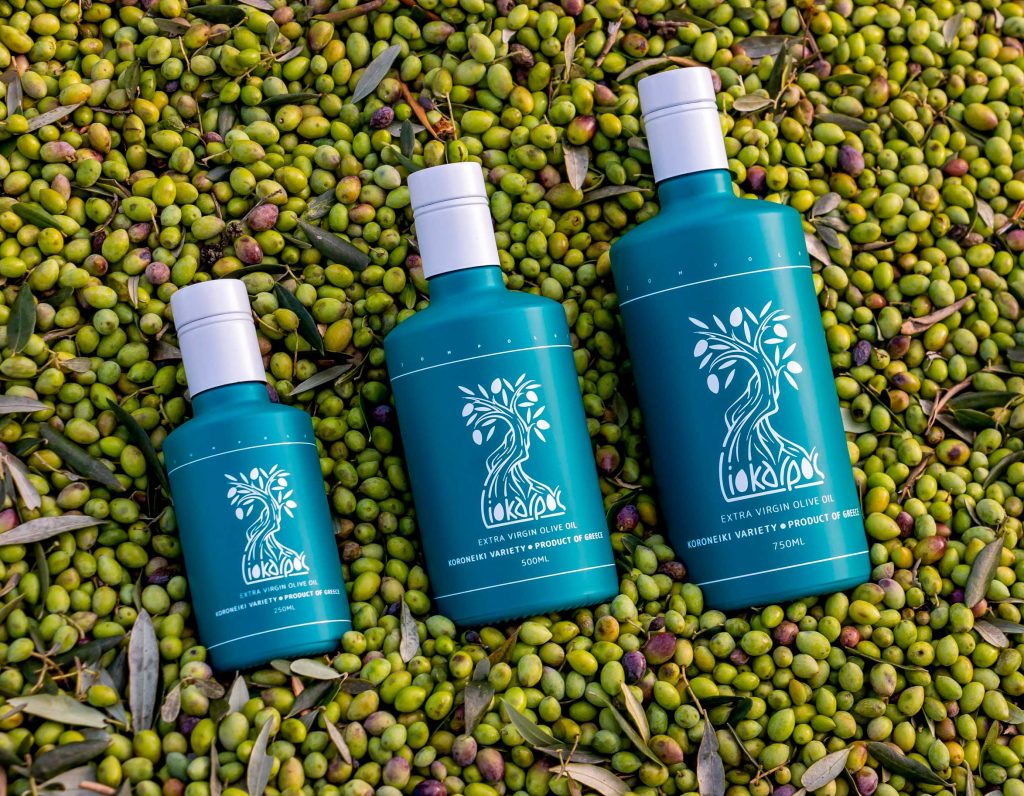
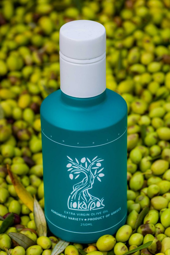
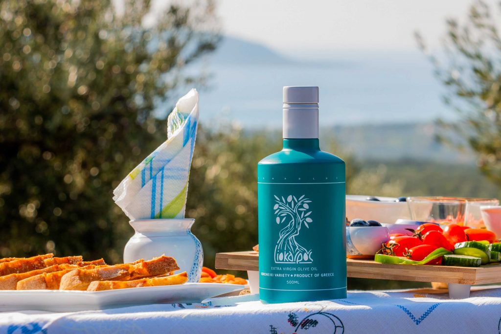
For the packaging of Liokarpos Extra Virgin Olive Oil, the glass bottle was baptised into the selected pantone and then it was printed with white elements for a really premium look.